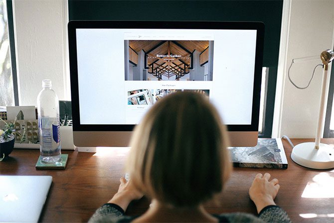
Web design is a constantly evolving field. The way websites are created depends a lot on two things: user habits and technological advancements. As the manager or owner of a business, you might be hard-pressed to make decisions about your page. These days, it is more than just choosing a color scheme, theme, or font; it is about the user experience.
It takes about twenty seconds for a user to decide whether they’re staying on a new website or not. As such, it is important for your web design to be top-notch—not just aesthetically but as it relates to the user experience.
To help you with your next big redesign, we have created this list of tips and tricks to help you achieve better design and better functionality. With no further ado, here it is:
1. Take customer feedback into account
Customers are often an underutilized resource. As the sources of your profit, making your website more appealing and convenient to them is a prime objective. As such, it would do you well to listen to their concerns about your site. You can do this by offering promotional discounts for those who answer a survey, or as a part of your email marketing.
Here are some of the questions you can ask:
- What made you stay on the website?
- What made you want to leave the website?
- Is the navigation menu good where it is?
- Is the color scheme appealing to you?
These are just some baseline questions. There are plenty more you can ask, but these are a good place to start.
2. Make good use of color
Color psychology as it relates to marketing and ecommerce is a wonderful tool for optimizing your website. Colors can evoke certain emotions as well as convey messages in subtle ways. For example, pastel tones often evoke a sense of calm or luxury, depending on the shades. Orange conveys energy and motion, while blue sends a message of reliability.
Not only that, but some brands have become so defined by their main colors that they are identifiable at a glance. Brands like McDonald’s with its red and yellow, and Adidas with its black and white are just some examples.
3. Don’t be afraid of negative space
Negative space (also known as white space) is the space in which there is no content. No text, no photos, and so on. This is an important element of web design because negative space can be used to turn focus and attention to the right parts of your website. Your call-to-action, for example, is a good example of where the user’s eyes should land.
Photos, videos, and text could also be greatly emphasized if negative space is properly used.
Final thoughts
There is no end to the ways you could creatively design your website. All it takes is a collaborative effort with your web designer so that you could end up with an online presence that matches your brand without sacrificing the experience of your customers—so long as you keep these tips and tricks in mind.
If you’re looking for help with your web design in Meridian, send us at Springboard Labs a message. We offer free consult calls and always strive to make the process as easy as possible.


